Sorry, more of the same facial expressions – but I gotta finish up after Part 1!
I tried for a little bit of variety with the last 3 sets, the first one continues after the last picture, when I’ve added some colour to the situation. These are more beauty/mag/FHM kinda shots that I was going for.
Trying to get a bit of a sexy look going on, seen as people seem to fixate on the names I give pictures (when the names don’t mean anything…) I’m going to stick to numbers.
#1
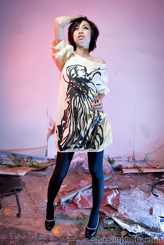
#2
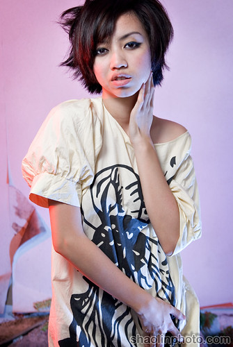
#3
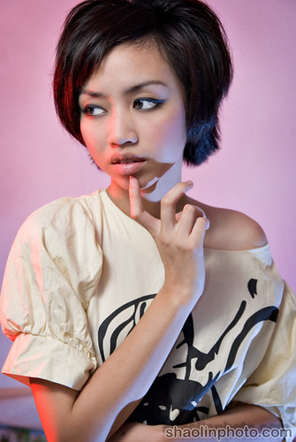
These next two were just by chance, I saw some lovely natural light (with a natural vignette) on the stairs back down to the ground floor. There were some great shots…but all the same facial expression, so I just picked these two.
#4
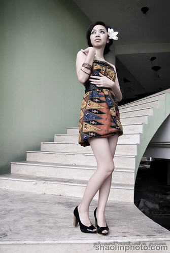
#5
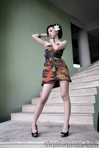
The last set I tried to elicit something stronger from Valerie, some real emotions…I went for a kitsch b-movie horror kind of look with a strong green cast. Somehow I think it worked with her theatrical expressions.
#6
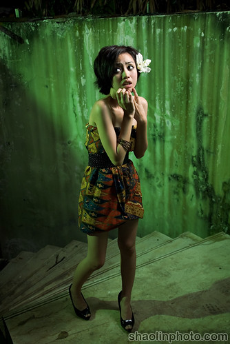
#7
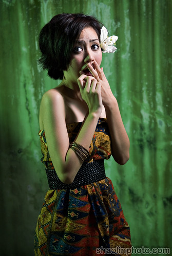
#8
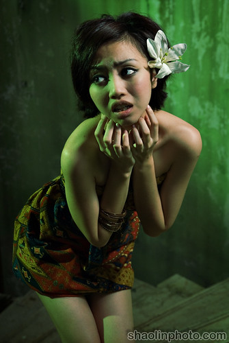
So what do you think of this set, a bit better? More variety? A little emotion carried through.
Got a big shooting project on this weekend, hopefully will some good pictures out of that!


i like #6 the most!! the green background, the stairs and of course valerie.. NICE!
I like no 5. of all photos and the three horror photos, background is totally awesome.
Model…. well… hmmm… err… aaa… I’ve nothing nice to say so I better not ruin ppl’s TGIF’s mood.
i like #5 !!
I totally agree with photo #5. For the horror photos, the background and colour looks promising.
#2, #5 and #6 me likes. =)
green = horror?
Nice creative lightning there
me likey!
Ah yes, a photoshoot named after my pick up technique. I spot a Beauty, hit them with one of my classic lines, and they run away in fear! /:-)
I like #3 and # 5. I like the way you’ve captured her legs in number 4.
Kinda like #5!
Ah yes a lil more expression in this part of the set as you said.
Lighting in #3 looks really nice and I liked how #5 emphasized the leg along with the pose.
For some reason i feel #6 is a wee bit weird, though she definately had something going on there where her eyes are looking towards the part where the greenish light ray came from.
Good to see theres slight improvement in the expression.
i like #2 n #5..its so sexy…yah..its true dat vale has difficulties in conveying her emotion during the shoot..i was there ‘busybody-ing’…well, cant blame her..she’s young, new to this industry and still learning…just give her some time to improve herself…
btw, keep up the good work ST…
she may have the figure but i still think tat she doesn’t have the emotion or expression in her shootings..
Nice shoots – I’m nanging this Shaolin :))
actually i like #4 n #5 most … 6 7 8 the expression is too…over exaggerated a little, hrmm..just my two cents ^^
Hi, her emotion is fake, but i really like the lighting.
I prefer the first serie. Which lighting configuration do you have for “smashed”? can not be natural light only.
Cheers
heys.. thnx for swinging by my blog.. appreciate it!
*unleash the tiger!*
haha!
I personally like #1, #6 and #7 due to the composition and the contrast between the model and the background. I’ve tried shooting photos of models and a lot of it depends on the model’s repertoire of expressions, which you can’t really control. You’ve got a good one here though. Cheers!
joshuaongys: Thanks!
Balqiz: Yeah #5 came out awesome, and thanks – be kind!
chyu: Wanna do shoot loh? Heh.
eiling: Subtle…subtle.
Nigel: Good picks, I really like #2.
WanKidd: Yah it gives me that grungy the blob b-movie kind of feeling.
Dabido: Hahaha, nice one.
moons: Yah tried to push it a bit more, got something at least. A bit more dynamic.
Auddra: Yah a bit more FHM feel for those two, came out pretty well. Agree, she needs to work harder on it too. Modeling is tough!
jolene: I think we’ve established that already.
JustJasmine: Thanks, appreciate it.
grace: Yah those 2 are very natural, the last 3 are supposed to be OTT kitsch style.
Gerald: Yeah it’s supposed to be heh, Smashed using white shoot through umbrella from above and left of camera, natural sunlight from behind.
Huai Bin: Yah it’s not as easy as it looks, it’s took me about 2 years to learn how to take a half decent portrait..and I’m still wayyyy off where I want to be.
I like #5. That’s the only pic without the weird mouth expression. WTF is with her mouth!! *pout*
i LOVE them all….. better than the first 2 parts..
those eyes.. those funny/cute poses.. we want more of her..
with some improvements btw.. hhehehehe
GOOD JOB u 2!!
look forward to more pics frm u…
Nick: That one I can’t control haha.
tk: Thanks Hope she can improve, and so can I.