Here is the first proper set of the Urban Decay shoot, these are the first 3.5 sets, another 3.5 to come after this. As you know what I did this weekend….here are the rest!
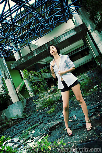
The first set was out front with all the broken glass, I went for an xpro oldskool kind of look, I thought the green tint fits well with the environment and the decay.
Twisted
Dreams
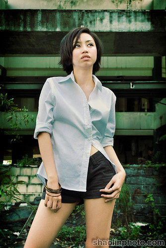
Smashed
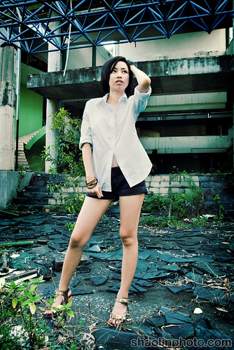
Lost
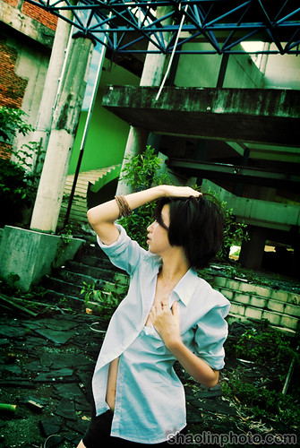
For the second set we moved upstairs to the place where the picture I first posted was taken, there was a lovely flaky wall there too.
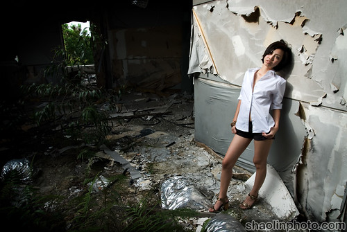
Alone
Beauty
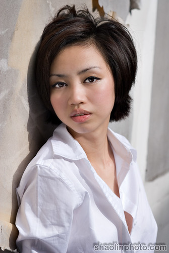
Captivating
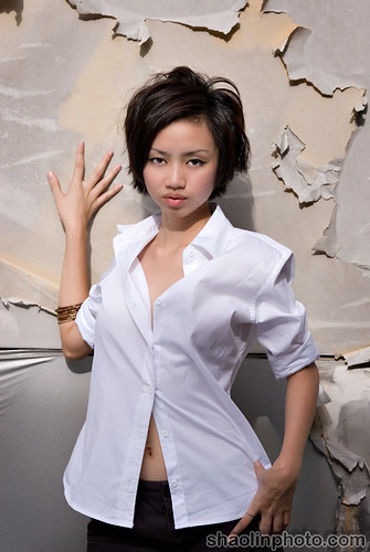
After that we moved into the center where the original shot was taken.
Dance

Cold
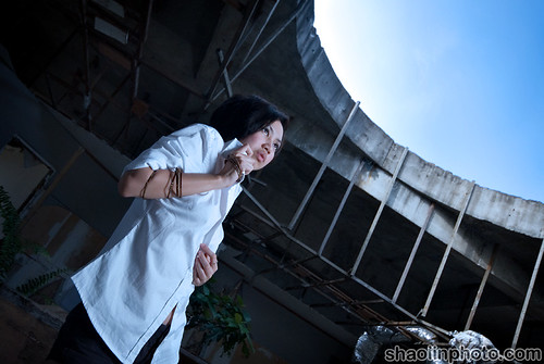
Questions
There was an interesting room just to the side which I used for the next set, these are just the first two when I was setting up the lights.
Daze
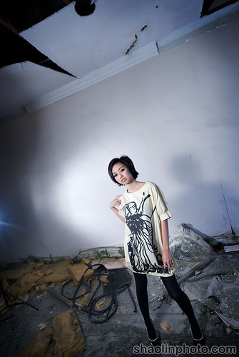
Emo?!
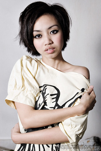
Looking forwards to Part 2? Will post the pics in FHM soon too, as the issue is out now I can upload the pics I took for the Redbull Rookies which are featured in August FHM!


OF CUZ AM LOOKING FORWARD TO PART 2!!!! faster heeee
Model has really Nice figure! You’re a great photographer. Do you help non-model ppl take photo?
Great shots! I like the amber tones for Twisted, Dreams, Smashed and Lost. Give the pics a whole surreal feel.
Thanks for sharing!
joshuaongys: Hehe ok ok, maybe tomorrow
simpleU: Thanks, yes I do.
al’sera: Yah I wanted to give them that dreamy/aged/urban feel.
to me her face expression looks the same in all pics..
I think my girl has gained some weight, and Im happy for her. Tiger you did a great job (telling you the second time already).
agree with manis.. my sayang gained some weight..
she sure eat alot of bread .. so she got bread face now.. *sorry sayang*
haha… :p
but tis reflect of her happiness !!
ST !! lookin forward for part 2 ….
fast !!!!!!
love ur shooting..
keep it up..
Great photos tiger
The photos look fabulous! But I gotta agree, her face looks pretty much all the same but yea what do I know about pictures =p
With the great photos that you take, I wouldn’t be surprised if you get hired to do wedding shots that is IF you haven’t even already got hired to do =)
The pics turned out great. i like the location you picked for the photoshoot. Very interesting!
jolene: Yah she’s learning, she’s doing ok
Hanis Zalikha: Weight? She looks skinnier to me..Hehe thanks – You can tell me 3rd time when I post the second half!
chyu: Bread face?!? HAHAHAHHA, that’s funny. Thanks, will post more soon
Samantha Poh: Thanks, nice to see you here.
moons: That one not to do with picture, not my fault! It’s model lacking expressions, had a hard time to elicit stronger emotions from her…as you have to act a bit OTT in front of camera for it to come across. I’ve been asked about wedding shots quite a few times…not really my thing although it is where the money is.
eiling: Thanks, it’s a very interesting place.
lol. these are FHM photos? =) they’re quite tame compared to what i’ve seen of FHM in the Philippines. grin. if ever you need someone to move lights around, please holler. will be the observant slave.
Ah yea, I know it isn’t your fault But of course, facial expressions I suppose all are depending on the person itself.
I don’t really think its something which is so easy to learn unlike other stuff ( posing or catwalking etc ).
I have to say, I pretty much liked Kim Ong’s facial expressions. Her expressions in the photos you took were just amazing.
she does not have much variety where facial expressions are concerned. And OMG, the last pic. Her lips are PEELING!!! Get some Vaseline girl!
loved the pictures. model’s expression in first few pictures made me cry.
was laughing so hard i teared up hahaha.
Dont you have any other models?
You had a great urban decay set but it is lacking the emotional appeal that holds the model and the set together.
The lack of emotional appeal I would say is to do with the model not being able to express herself. She did the same facial expression throughout. On the composition techniques. In certain shots, it’s worth trying focusing a certain decaying area instead of trying to cramp too much into the picture.
Not all models are born pose. And many times, a photographer needs to bring out the best in their subject to achieve that strong emotonal connection in the picture.
In the 1st picture, entitled ‘Twisted’. The only thing I can relate to ‘twisted’ is her ‘twisted’ leg. I don’t get it.
2nd picture, entitled ‘Dreams’. I don’t see anything dreamy about this picture. The expression and body language does not convey anything dreamy.
3rd picture, entitled ‘Smashed’, pretty much the same thing as pic 1. Don’t get it.
4th picture, entitled ‘Lost’. Can’t see her facial expression, her body language reads ‘Im HOT and sexy’.
5th picture, entitled ‘Alone’. I like the door at the background but it would be better if you can find her some decayed furniture or something instead of leaning on a piece of ‘something’ that I can’t make out what it is.
6th picture, entitled ‘Beauty’. No comment
7th picture, entitled ‘Captivating’. Like the expression of her eyes.
8th picture, entitled ‘Dance’. Like this angle and her pose.
9th picture, entitled ‘Cold’. I don’t feel the chill looking at this picture.
The rest of the picture… don’t get it.
bad boy : captivating, imoho, is your money shot.
you squeeze “expression” when its required pending, on what you have in mind – else you will experience some serious “over-emo” overdose, which is from set to set – boring.
no one actually bothered to ask what you have in mind before commenting on the expression part – so, its fair play.
karen – here is a “take away” thought from the stuffs you “don’t get it” – an apple do not have to be red to be an apple. why limit your imagination?
steph: FHM? Nah where did you get this idea? These are more towards high fashion. There’s some in the second set that are a bit FHM-ish. I’ll post the ones for FHM soon, I’ve got the go-ahead.
moons: Yah, I suggest most models to go for acting and theater classes, it helps a lot. Kim Ong had very good expressions, very versatile – she was good to work with.
sharon: Agree and agree.
Irene: HAHAHAHA – bitch!
Az: No, do you want to volunteer?
karen: Yah I agree, Valerie needs more training and practise. I thought she was ahead of where she is, this is a very strong location and needs a powerful emotive expression from the model. Don’t fixate on the names, they don’t mean anything – they are just a way to reference the pictures. From now on I’ll number them.
potatoe: Thanks boss, you da man. Agree with you on that, still trying to get the finer points down but so far I found it depends a lot on what the model can do (for me) I haven’t got the point where I can work around that very well if they don’t have much.
i love the close up pics!! xpressions were way better than other shots… others’ xpressions were pretty much the same.. but, wth… we LOVE her anyway!!
wink!
tk: Thanks, you’re kind
good pictures… the model has a good body but not a particularly fascinating face, expressionwise or featurewise. pity.