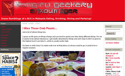
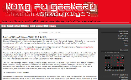
Yah so I finally got around to revamping this site, I’ve been meaning to do it for ages, I was still using WordPress 2.0.10 and hadn’t even moved up to 2.2 branch yet.
Plus I was getting really bored of the old Chinese takeaway font header and the whole thing was too cluttered, it was giving me a headache.
This theme has been up since January 1st 2006 when I switched over to WordPress from bBlog. This was v2.0 of shaolintiger.com.

I did like it when I first did it, but moving to WordPress I think I went a bit overboard with things, especially the 10-mile long sidebars.
The loading time was a bit of a pig, it’s much faster now..I feel anyway
Previous to that I was using bBlog since October 2004 when I launched this blog, that was v1.0 of shaolintiger.com.
I still really like the simplicity of bBlog and the template I was using.

bBlog was just getting bogged down with spam and lack of updates…that’s why I jumped camp to WordPress, I can’t say I’ve regretted it at all. I feel totally comfortable with WP now and power all of my sites with it.
I’ve updated all the plugins to the latest versions too, included proper tagging and a tag page.
Most of the clutter is gone including the long ass sidebars with all the useless junk. I’ve just kept a few things I like and find useful.
I’ve added a few more web2.0 widgets so you can stalk me easier and of course got a new header image.
It’s about time I updated the About Me page aswell I think.
If you notice anything wrong or something out of place, or anything missing from v2.0 let me know in a comment or via the contact form.


Neat!
nice site bro where’s ur photo gallery ?
and what’s Ed using ?
https://www.edvineng.com/
my suggestion, for the header menu, a black text for hover effect ain’t doing great. a bit hard to feel the effect… try switching the background and text color when for the mouse hover effect… try white background, red text… my two cents
Great this new blog is way faster than the last one
Good theme! Very well organized, and yes, less clutter. Loads faster too than the previous one.
On my Fedora Machine the header is to the left and the content is to the right. I’ll send you a screenshot of what I mean once I get on my XP machine.
nice new layout definately looks cleaner now, especially the header.
Really nice, especially the header with web 2.0 looks.
neat design!
few things though.. the icons under ‘stalk me’ don’t seem to be aligned. also as for the display of comments, it’s hard to distinguish visually the commenter’s details from the actual comments itself.. ah well.. that’s my opinion anyway
Sweet layout and design, ST!
However, I still prefer the previous header image
it looks neat.
you took out the diving part?
much cleaner with the fixed width. I’m also thinking of switching to another theme, perhaps something slightly wider though
hey….cool post
Nice. I much prefer this to the old 3 column layout. Very clean.
neat and simple. nice !
Load alot faster than the previous one! well done boss!
Looks clean and neat overall.
But don’t really dig how the comments comes up though
Thanks for all the feedback everyone!
terenceg: Gallery link is at the top, using Flickr He’s using Gallery v2, I’m working on a portfolio site now.
Mossie`Ol Chin: Will try that out, thanks!
Dabido: That’s really odd, I’ve replied your e-mail – Thanks.
slacker: The icons were an Internet Explorer issue, I’ve fixed it now.
Ben: Yah I haven’t been diving for ages (sadly).
v0ices & slacker: Yah will do something about the comments, I don’t find them too clear either. I’ll find a style that a prefer and port it into the style-sheet, I haven’t really worked on that part yet. Was concentrating on the main layout and sidebar.
Wonderful looking site mate!
Definitely neater and it loads faster for me.
Fixed width? You?
Nice. Pleasant on the eyes.
Mark: Thanks – I’m glad it loads faster for everyone!
thatjames: Yeah..it’s funny how things change in cycles, fixed width went out for a while, now it’s back with a vengeance.
Sorry to dig up an old topic, but did you design the whole theme yourself? I may need a tip or two
Matthew: Pretty much yeh, it’s based on an existing theme but heavily modified.