During the weekend one of Kim’s friends was around, and I’d had an idea for a photoshoot in my head for a while..so we headed off to a carpark to take some urban portraiture.
I used artificial lighting as the carpark was very dark, mostly an SB-800 with a reflective umbrella and a naked SB-600.
Before the shoot I had a good idea of the look I wanted to achieve by using a cross-processed style.
I’m pretty happy with how it turned out, let me know what you think and which picture is your favourite.
Also if you are interested in any portfolio shots or have any interesting ideas for a photoshoot let me know.
First Shot
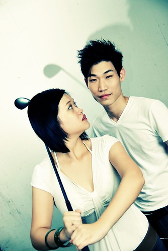
Just Cool
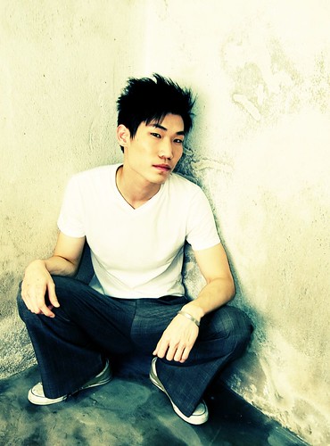
Attitude
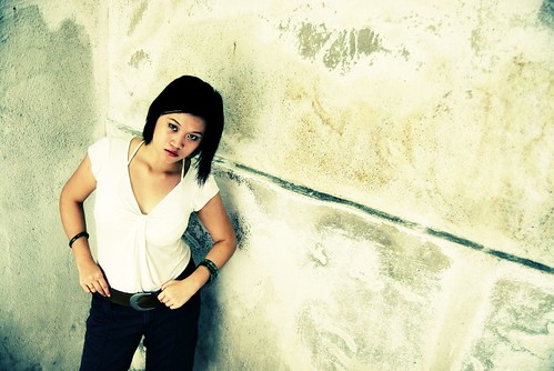
Escape
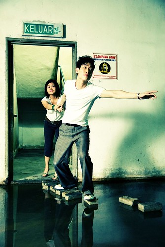
Abandoned
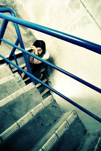
Wondering
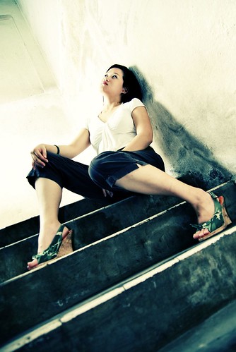
No Park
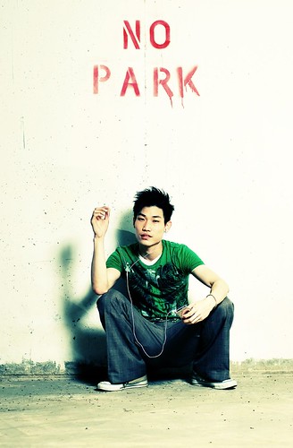
What a POSER!
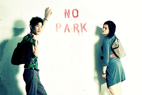
Stylin
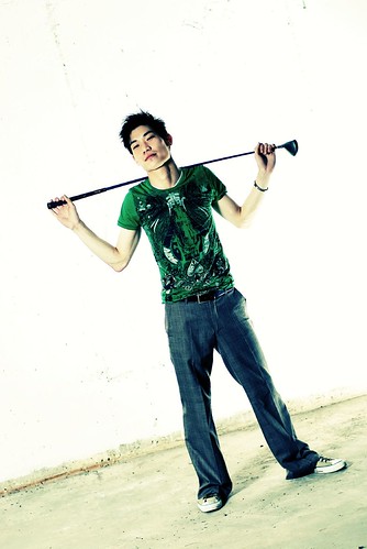
Thanks to Kimberlycun and Ie-Tsen for being so sporting!


I like it. Me likey very much
Gosh, if I’d have to pick my fave, hmm … I’d pick “No Park”
yeh no park looks rather good, looks like some commercial for an ipod or one of those digital mp3 players.
i like the abandoned look the most i suppose, the colours look nice.
“Escape” for me!
oo nice, but how come kim’s shadow looks a bit funny on the 2nd last pic?
Escape is nifty.
Could the funny shadow on Kim be the speedlight cutting her head’s shadow from the shoulder onwards?
Since your light would probably be sitting on the ground.
marina: Thanks, I think that’s my fav too, some iPod advert thing going on.
moonss: Thanks man, I find that one has good emotion, plus a pretty unique composition.
mooiness: A lot of people like that one, it came out really well I think.
KY: It’s from the cross light, if you look 2 carefully there’s actually 2 shadows so it looks a bit odd, 1 big and one smaller. You can see it more clearly on Ie-Tsen’s side.
Dr. Tan: Thanks Yeah it’s the rear light cutting the shadow from the softer light, that’s why there’s one big shadow and one small from the 2 diff light sources.
Escape is a kewl shot. I also like Attitude.
Hmmm … ideas for a photo shoot … what sort of suggestions need to be in the idea?
Like, if I say a small group of people hanging off scaffolding , is that enough of an idea, or do I need locations, type of clothing, sort of look or effect to go for?
Would you like restrictions in order to help you be creative? Like, only shots shooting into the sun, or , all subjects must not look directly at the camera?
How about one of KY next time he is in a bathtub collecting oranges from a lake/river?
my favourite is No Park.
second favourite is Abandoned. But I think Kim should have looked more downcast; her eyes came off more like angry than abandoned in that setting. dunno, but i think the body language, the environment was more suited for someone who was Abandoned = Sad , not Abandoned = Angry.
I didn’t like the last one that much. Just didn’t resonate.
I really love no park and just cool. No park wins 1st spot…looks like proffessional ads frm Levis or sumthing. Escape is excellent but Kim’s expression spoiled it big time, no? Kims pretty but dunthink she has the knack for modelling. I think u did a really good job tho. =)
I’ll take abandon…it looked candid enough without being a poser.
it’s like you stumble upon Kim crying in the stairwell…
Love the cross-processing. Of all your latest photos, this series is my favorite. I like the shadows of “First Shot” but my fav is “Just Cool”.
I choose Escape and No Park as my favourites. The water and bricks in Escape and the urban fashion ads in No Park.
seriously, i like them all..-_-”
but i preferr Ie-Tsen to appear more fierce look lolz
-_-“
the tittle “Reflection of Me” in your flicker is my favourite.
From the above, it will be the photo “Just cool” minus the baggy 70s jeans. the jeans, is just too clean, don’t you think?
Anyway, great shots!
the ‘keluar’ pic is cool
sorry for the second comment but i am on windows xp not os ten as indicated… though i am using the safari 3 beta for windows. guess the system can’t distinguish between the two yet…
very artistic..golf clubs and car parks..looks like you guys are going to find some cars to break into..hehe
photo #4 would be much better if the long shadow of the hand was in.
‘escape’ is cute and funny! the floor seems wet, is it?
Dabido: I’m open to any ideas really, thanks for the suggestions. Any directions/suggestions are fine, including those about wardrobe, posing, direction etc. Everything helps!
suanie: Yah No Park rocks! Will have to pay more attention to expression in the future, it is a weakpoint I have.
Diyana: Thanks, as for Kim’s modelling I think it’s a thing that can come with practise and experience. She has quite a unique look so we have to work on it to get the right outcome I think.
stupe: Thanks, that’s the feeling I was trying to convey.
tracy: Thanks, I’m really pleased with the outcome of this set too, just how I wanted it.
ice-milo: Haha ok, will try that next time.
Musa: Yeah I guess, it was just an impromptu shoot though so we didn’t have much options for wardrobe.
hello: Yeah for some reason Safari automatically assumes OSX even though it’s wrong. I have updated to the latest version but it’s still the same.
lotsofcravings: Thanks, trying to do some different stuff, make things a bit more interesting.
Donny: That’s an interesting detail, thanks.
lasilasi: Yah the stupid carpark is always flooded.
Very good indeed.